Friday, 25 March 2011

Evaluation

In what ways does your media product use, develop or challenge forms and conventions of real media products?


How does your media product represent particular social groups?
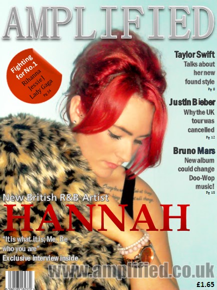
My magazine has no real stereotype of which people would be best suited to read it. However due to the nature and subject of the magazine, it would target social groups who would be interested in listening to music and  perhaps aspiring to be a musician. I represented the target audience by using a relateble model of a similar age who could be seen as a role model to the readers.


What kinds of media institution might distribute your media product and why?


Who would be the audience for your media product?
The audience for my music magazine would be teenagers to young adults who I found through a detailed questionnaire to be interested in modern day music and a range of artists - most commonly the music in the charts. I used a model of the same age group to represent and appeal to the target audience. The colours I used on the media product attracts both males and females, and the layout is simple - not to busy so as not to intimidate people.


How did you attract/address your audience?
I attracted my audience by using a model from the same age group as my target audience and the bright colours on the front cover would also catch peoples eyes and make them pick up the magazine.I used a variety of codes from real life 'indie rock' music magazine. so i chose typical colours; white green and red, then i colour matched it with the pictures I took as well to match it up and make my music magazine realistic.


What have you learnt about technologies from the process of constructing this product?
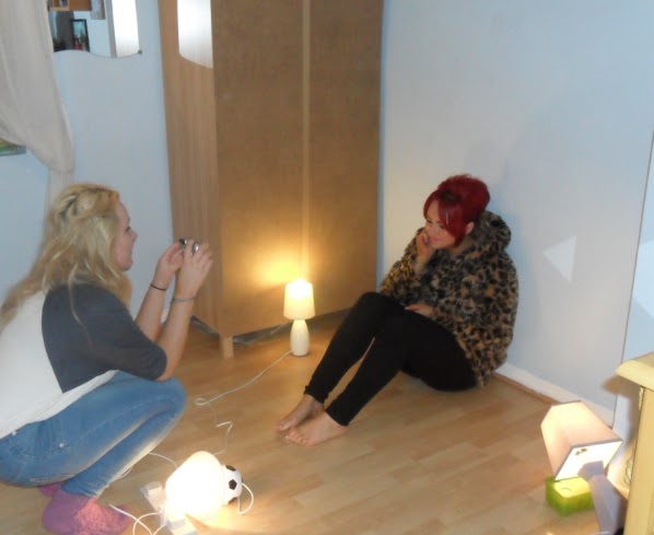
I have learnt how to use Photoshop to cut and crop photos and to make them look more effective by making the colours brighter, covering and blurring any imperfections and all in all creating a more professional look to the photos. I have also learnt how to use blogger.com to create my blog, and display every element of producing the final media product. I was able to upload pictures and edit posts. At times I found this programme quite hard to use particularly when moving images around, however after plenty of practice I feel that I managed to use blogger.com to its fullest potential.


Looking at your preliminary task, what do you feel you have learnt in the progression from it to the final product?
When I look back at my preliminary task I feel that my media knowledge and computer skills have increased considerably. I have gained insight into the process of developing a media product and now have a better understanding on the research, planning and construction of a magazine. I have also learnt about the kind of things that are generic to a magazine, meaning that I now know what to include and how to lay it out and which colours appeal to certain demographics and most importantly how to differentiate between an upscale, admired magazine and a cheap, tacky magazine; which regrettably was the embodiment of my preliminary task.

Thursday, 24 March 2011

Final Double-Page Spread

Final Contents Page

Final Front Cover

Construction: Creating the final design

I decided to use Powerpoint to create the final design, although  it made not have been an obvious option, I find that I can use Powerpoint better than any other programme, so I went with what I know.


Once I had the photos in the right positions I could easily add shapes, text boxes and use different fonts to create the right look for the magazine.

Construction: Editing Photos

After deciding on which photos would be appropriate for the front cover, contents and double-page spread, I edited them using Adobe Photoshop Express Editor.
Editing the photos was a simple process. I used the touch-up tool to hide any blemishes, made the image brighter using the fill light, highlight and white balance tools which also made the colours much more vibrant. I then used the sharpen tool to make certain areas clearer.


Before and after editing:


Construction: Poses/Props/Camera Angles

Throughout the photoshoot, I found that it was best to try many different poses, to keep varying the camera angles and to incorporate props/clothing to capture the perfect photograph.

Here are some examples of different camera angles, poses and props:


Thursday, 17 March 2011

Construction: Setting up the Photoshoot

To fit in with the colour scheme, I needed a plain background; coincidentaly my bedroom walls are blue so after plenty of rearranging I had the background I needed for the photoshoot.

I then played around the lighting, placing them in different areas around the model to see what places worked best and didn't create too many shadows.

Equiptment needed for the photoshoot:
Camera
Tripod?
Lamps
Mirrors

Props/Model Necessities:
Model (Hannah Morrall)
Fur Coat
Black Leggings(Plain Clothing to keep the focus on the model)
Black Long Strap top
Make up
Jewellery
Union-Jack Cushion (it will become clear)
Black Heels
Nude Shirt


Planning: Colour Scheme

From the resluts of the questionnaire it is obvious that the colour scheme needs to include silver/blue/red/black/white in it. I made two different colour bars to see what shades would look best together.

I think that the first colour bar works much better than the second. The colours are much more subtle and I think if they are too bright it can make the magazine look tacky. Therefore my  chosen colour scheme is the first bar.

Planning: Double-Page Spread Layout

Wednesday, 9 March 2011

Planning: Front Cover Layout

For the layout of my music magazine I looked at a few well known music magazines (Q, Rolling Stone, Billboard) to see how their front covers were laid out. One thing I noticed in all of them was that an image of the Singer/Band was in the centre of the page and the other articles written around the edge also there are no other photographs on the front page. Another feature that stood out to me was that the name of the magazine and artist is the biggest text on the page and there are a variety of fonts on the page.
As these magazines are well known and instantly recognisable, the name of the magazine is often slightly covered by the photograph, however as my magazine is new I think it is important that it is clear and in full veiw.


After researching into current front page layouts, I came up with my own to use for the final music magazine cover:

Monday, 7 March 2011

Planning: Title Colours

Sticking to the colour scheme chosen by the demographic, I have tried out the title in these different colours;

The connotations of the colour blue could be a mixture of both ad and good things - for example when some people see blue they think of a clear blue sky, the sea, calm, relaxation - but others may think of the cold and sadness so at the moment I am unsure about blue. Red and black have similar connotations such as danger, warning, darkness, horror, mystery. In the sense of music black and red would make me think the magazine was focused on rock/punk/grunge bands.
I think that the silver looks the best as it adds a touch of glamour and shine. Obviously a title looks best when the colour contrast with the background. Again silver works well here because if a light background is used then an added shadow around the letter looks just as good and makes it pop and almost come away from the page.
Personally I think it looks a lot better in capital letters because it represents the meanings of the word "amplified" of louder and bigger.


Planning: Title Font

Along with the name of the magazine, the look of it just as important therefore the font and colour have to be just right. To get the perfect look I use this website: www.interactimage.com which lets you chose from a wide variety of fonts or create your own. I chose bold fonts to fit the title of the magazine.


Here are the fonts that I thought should be considered for the title:


I think that it is important for a font to be very simple so as to not steel the focus from the stories. To narrow the choice down to just one from the fonts above I have decided to eliminate any that may give the feel of grunge/rock/punk based magazine as I will be focusing on all genres. Which means I wont be choosing numbers 5, 6, 7 or 8. I also think that the font shouldn't be too busy andeasy to read therefore I can eliminate number 1 and 2.
From the choices left I have decided to go with number 4 because it is clean and looks very professional.